Tuesday, 3 May 2011


Further work on the ways i can get the idea of the my freedom theme across and that's what i have came up after what I experienced with the rope ones, I was thinking of using something much more powerful and something that cant be ripped apart as easily as the rope, now I can show something a little different by experimenting with these metal wires, the texture and the way it looks give the feel of prison and being trapped.

Light/Shadows/Shades


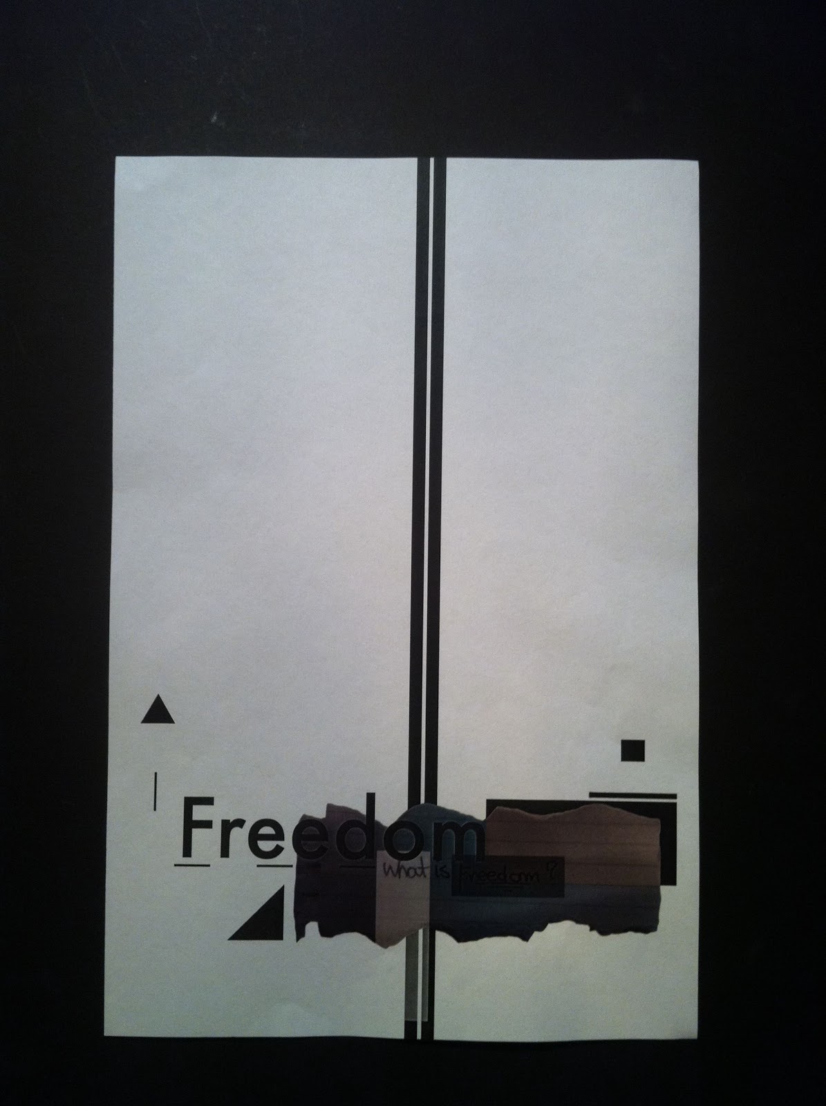
Here is more looking at the way I can position the letters and see how these will work if they were created in a bigger format, the idea is to use the small type for a book or for posters for the show. 
Here I have used the lights and look more deeply at the shadows and how the letters will look like as a picture.

Start Point!!


This is a start point for my freedom theme typography work, as you can see  I am trying to show the idea of freedom of speech by showing the type being tide down and the rips show the power of freedom of speech breaking throw. the whole idea is showing different ways of how I can get these idea across to the audience.

Monday, 7 February 2011

Experimenting


Paul Kenton


I wasn’t thinking of drawing something like this but what i was interested in was the movement you feel looking at his work and that one of the reason that this painting gets your attention and captures your imagination.

DADA!

If you think of Bauhaus graphic design style then you immediately think of sans-serif typography (Bayer famously banned serifs), clean lines, strong composition

Massive attack False flags

This video has a very powerful message and while watching this video you get the feeling that you are part of it, and by that i mean the video captures you, and you start thinking deeply about whats about to happened next. The clip is played in a slow motion and that helps the viewer to experience the emotion much better, this also helps the viewer to see this in a much more detailed way.