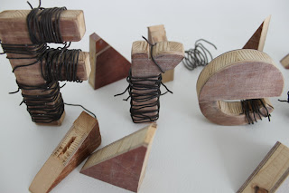
These are some of the recent work that i have been working on in my sutton lessons, as you can see I have used different materials and each letter will be different, in size shape and material and they all will be places in different places in the final year show.
Wednesday, 4 May 2011
Tuesday, 3 May 2011
Further work on the ways i can get the idea of the my freedom theme across and that's what i have came up after what I experienced with the rope ones, I was thinking of using something much more powerful and something that cant be ripped apart as easily as the rope, now I can show something a little different by experimenting with these metal wires, the texture and the way it looks give the feel of prison and being trapped.
Light/Shadows/Shades
Here is more looking at the way I can position the letters and see how these will work if they were created in a bigger format, the idea is to use the small type for a book or for posters for the show.
Here I have used the lights and look more deeply at the shadows and how the letters will look like as a picture.
Start Point!!
This is a start point for my freedom theme typography work, as you can see I am trying to show the idea of freedom of speech by showing the type being tide down and the rips show the power of freedom of speech breaking throw. the whole idea is showing different ways of how I can get these idea across to the audience.
Subscribe to:
Comments (Atom)


